What kind of websites are popular among foreigners? Thorough explanation of the design gap between Japan and other countries [with reference designs].
Table of Contents
- Japanese websites were difficult to view and unpopular with foreign users!
- Why Web Design in Japan and Overseas is Different
- Relationship between language structure and web design
- Color and Sensitivity
- Comparison of Japanese and International Web Design and Navigation
- Differences in the Use of Illustrations and Images in Japan and the West
- Design Differences in Margins and Layout
- How to use images and visual content
- Commonalities and Trends in Japanese and International Web Design
- Q&A Frequently asked questions about website design
Japanese websites were difficult to view and unpopular with foreign users!
The current situation is that Japanese websites are perceived as difficult to view and use by foreign users. I myself have heard many times from foreign friends from Europe and the United States that "Japanese websites are so complicated that I often give up on making reservations or gathering information. Even if there is a translation function, it is inevitable that foreign users will find Japanese websites difficult to understand due to differences in cultural design and information layout. Today, Japan is experiencing an increase in inbound demand, and it is commonplace to see foreigners everywhere you go. In such an environment, providing a website that is easy for foreign visitors to use is a very important strategy for small and medium-sized companies to survive as an inbound countermeasure. In this issue, we will introduce what kind of websites are preferred by foreign users and what are the differences in Japanese web design. If you are interested in dramatically improving your ability to attract visitors from your website (especially foreign users from Europe, the U.S., and English-speaking countries), please refer to this article.


Why Web Design in Japan and Overseas is Different
Differences in the way information is communicated
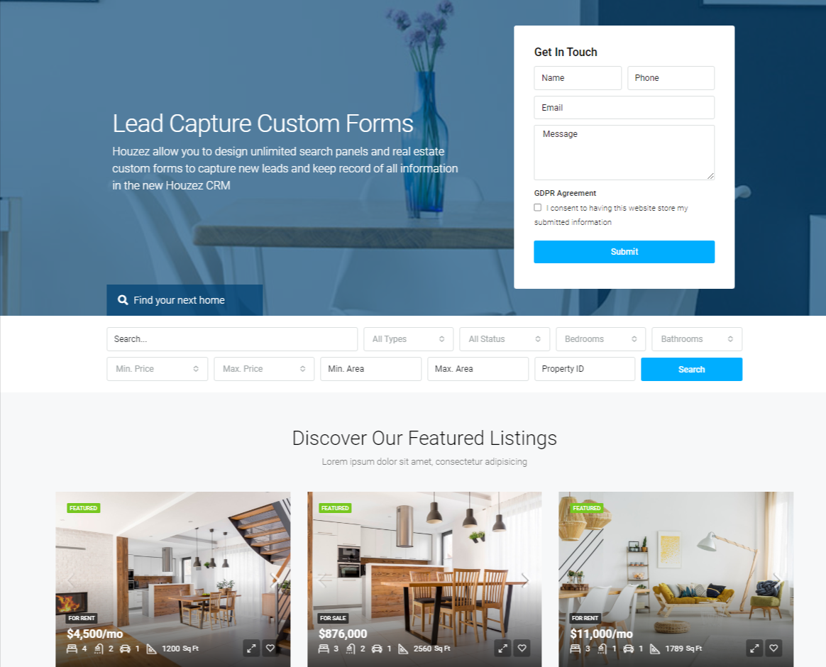
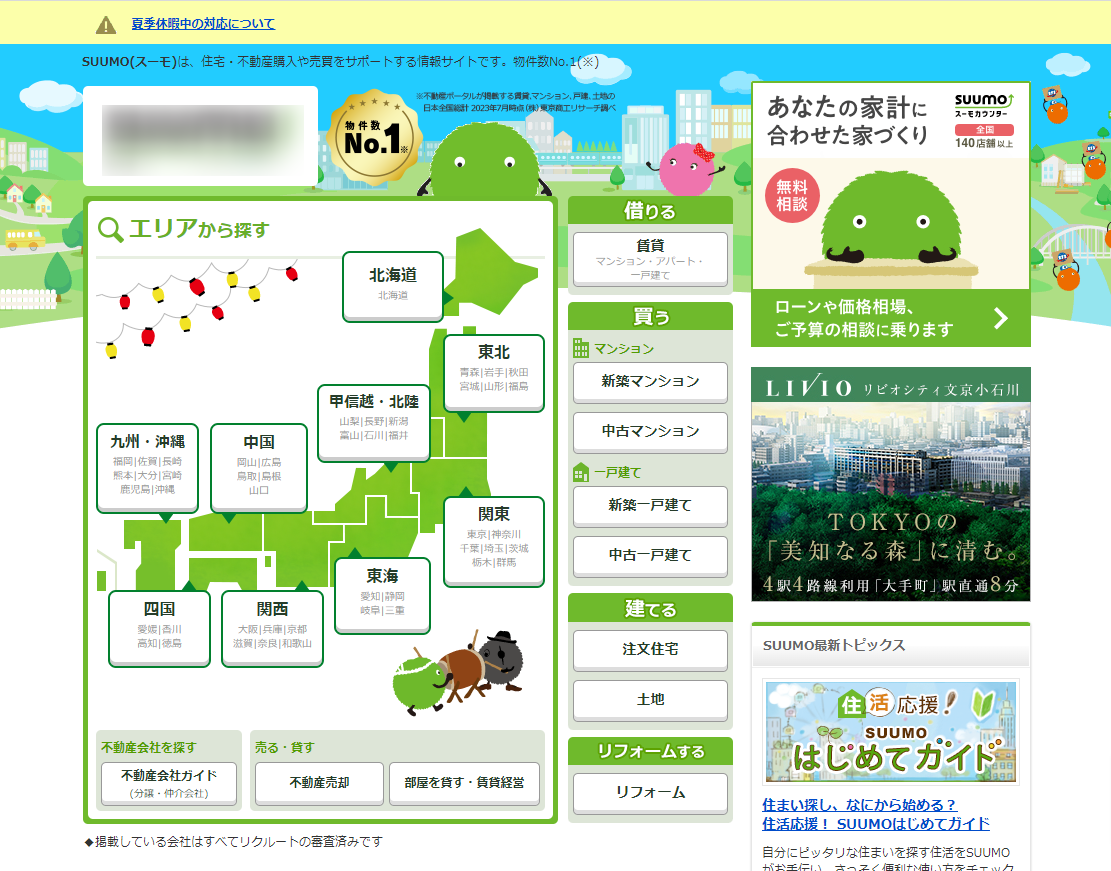
One of the reasons why Japanese and foreign web design differs so much is the complexity of the design and the way information is arranged. If you look at the photos above, the left side shows a typical overseas real estate website, while the right side shows the design of a major real estate website commonly seen in Japan. As you can see, the overseas site looks simple and uncluttered, while the Japanese site has a lot of information and looks somewhat cluttered. This is because Japanese websites focus on providing detailed information at once to meet the needs of domestic users. This type of design is adopted because Japanese users tend to want to see all information at once. However, this approach can be perceived as information overload by foreign users. On the other hand, Western users tend to prefer simple and intuitive web design. Therefore, complex navigation and multi-layered menu structures are often perceived as difficult for them to use. As a result, Japanese web design is sometimes perceived as excessive and not user-friendly by foreign users. Understanding these differences, there is a need to optimize web design according to target users.
Relationship between language structure and web design
The structure of a language has a significant impact on web design. The Japanese language has three types of characters: kanji, hiragana, and katakana, which allow for vertical writing and a variety of character layouts. However, this can easily lead to information overload and difficulty in reading, especially for non-Japanese. When letters are scattered in various places on the screen, the order of priority of information becomes ambiguous, which can lead to visual confusion. English, on the other hand, consists of only letters of the alphabet and is written horizontally. For this reason, a simple and organized layout is required, and margins and font selection are important design elements. As a result, English websites tend to have concise information and intuitive, user-friendly web design. Thus, the differences between Japanese and English have a significant impact on the approach to web design.
Color and Sensitivity
Sensitivity to color differs greatly between Japan and the West. For example, in Japan, green is widely popular as a color symbolizing "healing" and "peace. This is because it reflects the spirit of respect for nature and tranquility in Japanese culture. On the other hand, green is used differently in the West. In many cases, understated and subdued tones are preferred, with particular emphasis on minimalist design. The emphasis is on choosing a small number of colors to create a simple yet effective eye-catching, sophisticated impression. Thus, even the same color is perceived differently depending on the cultural background, so color design must be appropriate for the target market.
Comparison of Japanese and International Web Design and Navigation
There are significant differences in navigation styles between Japan and other countries. Japanese websites are designed to display many menus and links at once so that users can intuitively search for information. Therefore, a lot of information is often presented from the beginning so that users can quickly figure out where to find what they are looking for. However, this approach can sometimes feel like information overload, especially to foreign users. On the other hand, Western sites prefer simple, clean navigation. The main navigation menu is at the top of the screen, with sub-menus typically hidden as drop-down or hamburger menus. This approach is designed to provide users with smooth access to the information they need. Particular emphasis is placed on simple and intuitive navigation for ease of use on mobile devices.
Differences in the Use of Illustrations and Images in Japan and the West
The use of illustrations and images also differs between Japan and the West. Japanese sites frequently use cute illustrations and animations. This is because Japanese users tend to have an emotional connection to visual content and feel a sense of familiarity. In addition, visual elements play an important role in communicating information in Japanese culture. In contrast, Western sites often use photographs and simple graphics. Emphasis is placed on sophisticated design and high-quality images, which are used to emphasize the brand's image and message. As a result, the overall visual style of the site is often simple and clean, with no extraneous elements.
Design Differences in Margins and Layout
There are differences in the use of margins and layout between Japan and the West. In Japanese web design, the emphasis is on cramming in information, often with few margins and dense information. This is because Japanese users tend to want to see a lot of information at once, but foreign users may find the information too packed. On the other hand, Western design emphasizes the active use of white space and the organization of information. Simple, clean layouts are common, and care is taken to ensure that users can obtain information without stress. By understanding these differences and choosing an appropriate design, it is possible to provide a website that is easy to use for overseas users.
How to use images and visual content
There are also differences in the use of images and visual content between Japan and the West. Japanese sites tend to use more illustrations and icons. In contrast, Western sites typically use actual photographs and high-quality images. This is to convey a sense of realism and authenticity to users. Even the choice of visual content requires a tailored approach to the target market.
Commonalities and Trends in Japanese and International Web Design
Recently, Japanese and international web design trends are merging. In particular, responsive design and mobile-first approaches are commonly emphasized around the world. Improving user experience (UX) and user interface (UI) is also a global trend. Simple and intuitive design is gaining acceptance in many countries. By designing with these trends in mind, it is possible to achieve high user satisfaction in any market.


